A private label face cream photography brief should connect the product you intend to sell with the images your team needs to publish. It should explain which physical sample is approved, what each photograph must show, and where the finished image will appear. Without those decisions, a polished gallery can still leave buyers uncertain about the container, the label, or what is actually included in the offer.
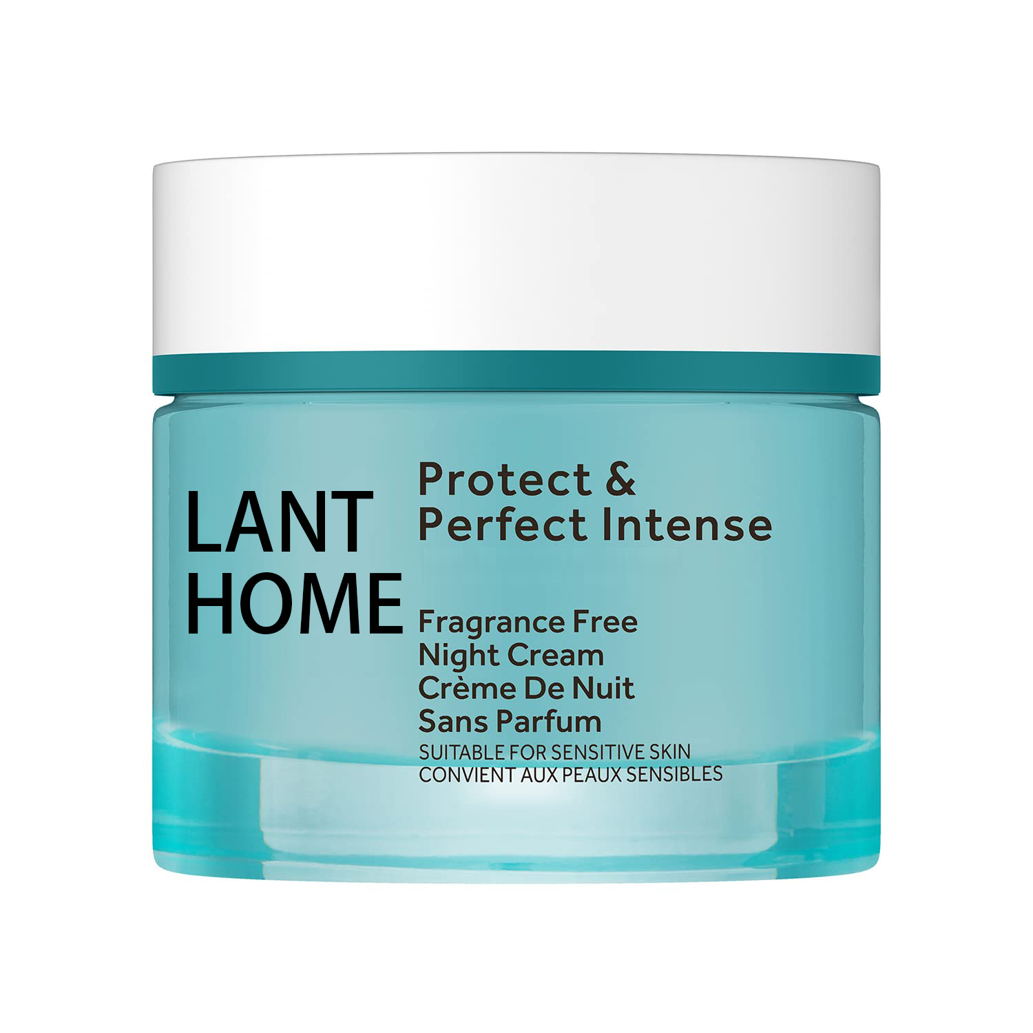
This guide uses the Lanthome face cream catalog reference to explain a practical photography planning process. The page lists model 1601648828313 in Face Care and presents OEM, ODM and private label service. Its main image shows a turquoise-colored jar with a white lid and existing printed wording. Those visible details provide a starting reference, not a final packaging specification for another brand.
The page does not provide a filled capacity or a numerical minimum order quantity in its specification fields. Its ingredient and benefit wording also needs project-specific confirmation. Keep those gaps visible in the brief. Photography can document the appearance of an approved sample; it cannot establish ingredient concentrations, performance, pack capacity, or commercial terms that have not been confirmed separately.
Start with the decisions each image must support
Before discussing backgrounds or lighting, write down what a buyer should understand after viewing the gallery. For a face cream project, that might include recognizing the front label, seeing the closure, understanding whether an outer carton is included, and distinguishing the selected variant from another item in the range. Turn each question into a proposed image, then remove photographs that serve no clear purpose.
Separate the needs of the product page from those of a campaign banner or a distributor presentation. A product page may need a straightforward container view. A banner may need room for a headline. A presentation may need a close view of a packaging feature under discussion. These uses can share a visual style, but they do not necessarily share the same framing or level of detail.
Write the intended audience beside the use. An internal packaging reviewer and a prospective retail customer may need different information from the same jar. This small distinction helps the photographer choose what should remain readable and helps the editor avoid filling every available space with decorative props.
Identify the exact sample before booking the shoot
Give the physical item a simple reference that connects it to the approved product and packaging records. The reference should identify the container version, lid, label revision and any outer packaging being photographed. Record who supplied it and who confirmed that it represents the intended offer. If the sample is provisional, state that clearly before anyone creates launch assets from it.
Separate reference images from sale-ready samples
The linked catalog photograph is useful for discussing a jar presentation. It does not establish that its printed brand treatment, wording or colors should be reproduced for your project. Ask for the appropriate physical sample and approved artwork rather than instructing a retoucher to transform the reference into an apparently finished private label product.
Keep a simple arrival record with an overview photograph and a note of visible issues. A scratched lid, tilted label or substituted carton can become an expensive problem after a full shoot. Decide whether the sample is suitable, whether a replacement is needed, or whether the resulting images will be limited to internal concept discussion. Do not leave that decision to the photographer by implication.
Build a shot list around a complete product story
Use a compact shot list with a purpose for every frame. A suggested starting sequence is a closed front view, a second angle, a useful label detail and a view of the included packaging. Add an open-container or texture photograph only when the actual sample and intended presentation support it. These are planning options, not a statement that every face cream requires every shot.
For each entry, specify what must appear, what must remain readable, and what must stay outside the frame. If the offer contains one jar, avoid styling a group of jars in a way that implies a multipack. If the carton is still undecided, do not build the main commercial image around a temporary box that might never reach the buyer.
Mark the essential images first. The team can then secure the core product story before spending time on optional compositions. This order is especially useful when a sample has a limited availability window or when several departments share one photography session. A clear priority list gives the photographer a practical way to make tradeoffs.
Make the front view easy to identify
A front image should help someone recognize the product at the size where it will actually appear. Ask the team to review both a larger product-page view and a smaller catalog-card preview. A composition that looks balanced on a large monitor can make the jar or label difficult to distinguish when reduced into a grid of products.
Define the preferred container orientation and leave room around its edges. Check the lid alignment and the direction of the printed label before shooting. When the container is curved, choose an angle that gives the important wording a fair presentation without inventing a flatter or larger label surface in post-production.
For the catalog reference, the turquoise-colored container and white lid are visible photographic characteristics. Do not turn those observations into claims about the exact material, finish or manufacturing color specification. If matching a brand color is a project requirement, provide the approved reference through the packaging workflow and ask the photography team how it will be used during review.
Plan open-container and texture photographs carefully
Texture imagery can help describe how a sample looks, but the brief should keep visual description separate from performance. A cream photographed with a shaped peak does not demonstrate hydration duration, absorption, ingredient content or suitability for a particular skin concern. Ask for an accurate view of the approved sample without attaching conclusions that the image cannot support.
Use the actual approved material
If a texture shot is needed, identify the sample used and record any preparation that affects its appearance. Do not substitute a visually convenient material and present it as the product. If a conceptual illustration is used elsewhere in the content, label it as an illustration and keep it distinct from the evidence provided by real product photography.
Discuss the display surface, tool and time available for the shot with the team. The aim is a repeatable presentation that reviewers can understand. Avoid inventing an application amount or usage direction just because a particular scoop looks attractive. Product instructions should come from the approved project information, not from the styling choices made during photography.
Keep props from changing the implied offer
Props should support the composition without adding unsupported information. A plant, fruit or ingredient-like object can lead viewers to infer a connection with the formula. If that connection has not been approved, choose a neutral surface or an abstract visual element instead. The same principle applies to seals, badges and symbols that could imply testing or certification.
Check accessories in the frame as carefully as the jar. A spatula, pouch or gift box may look like part of the purchase even when it was added only for styling. Where such an accessory is relevant but not included, choose a presentation and caption that make its role clear, or keep it out of the primary offer image.
Keep the initial product gallery simple enough to evaluate the actual object. Additional editorial scenes can be commissioned for a separate purpose once the essential photographs are complete. That separation gives the brand room for visual character while preserving a dependable set of images for buyers who need to understand the product itself.
Brief backgrounds, reflections and color review
Describe the desired background in relation to the site where the image will be used. Review it next to the actual page background rather than approving it only as an isolated file. A pale container can disappear into a similarly pale page, while a heavy shadow can become more prominent than the product in a small card.
Ask the photographer to show how reflective or translucent surfaces will be handled. The goal is to make the container legible while retaining its appearance. A bright reflection may hide label text, but removing every reflection can make a jar look like a different material. Agree on a reference frame before applying a treatment across the full image set.
Have the packaging owner and image reviewer agree on the reference they will use for color decisions. Avoid approving color through a chain of screenshots, each displayed differently and stripped of context. Record what was approved and preserve the original delivered file so later editors can compare their exports with the accepted version.
Design crops for the actual publishing locations
List each required placement and its intended shape: a product card, a product-detail gallery, a wide article banner or a presentation slide. Confirm the dimensions with the person responsible for the destination rather than assuming that one generic export will suit every channel. Platform and site requirements can change, so store the current brief with the project.
Protect the product inside each crop
Ask for enough space to create the needed variations without cutting through the lid, label or base. Preview the narrowest and widest planned crops before final approval. If the composition cannot serve both, request a separate frame instead of forcing an awkward crop from the same source image.
Identify where text will sit when the image is used in a banner. Keep that region visually calm, but do not reduce the product to an unrecognizable object just to create empty space. Review the image together with a representative headline. The combined result matters more than either asset considered on its own.
Set sensible boundaries for retouching
Write the permitted edits in plain language. Removing temporary dust from a sample photograph may be appropriate to the agreed presentation; changing the container shape, enlarging its apparent capacity or adding a nonexistent accessory changes what the image represents. Ask the team to flag any edit that would materially alter the product rather than treating it as routine cleanup.
Be particularly careful with printed text. Retouching should not create an apparently photographed label that has not been approved for the sample. If artwork is still being explored, maintain a clearly identified concept image and keep it out of the final product gallery until the project owner confirms how it may be used.
Request a comparison view for substantial edits so reviewers can understand what changed. Keep the original capture or agreed source file connected to the edited version. This does not require a complicated asset system; it requires a record that lets the next editor distinguish an original photograph, an approved retouch and an exploratory mockup.
Review images with specific, actionable comments
Assign one person to consolidate feedback before returning it to the photographer. Comments such as “more premium” or “make it pop” are difficult to execute consistently. Describe the visible issue instead: the front wording is obscured, the crop removes part of the closure, or a background prop competes with the product at card size.
Separate product accuracy from visual preference
Review accuracy first: correct sample, correct packaging, correct included items and appropriate wording. Then review composition, lighting and alignment with the brand direction. A visually preferred frame should not override a mismatch in the product being offered. Equally, an accurate photograph may still need a different crop to communicate effectively on the intended page.
Use a contact sheet with stable image references so everyone comments on the same files. Record the decision for each required shot as accepted, revision needed or replacement needed. When a revised file arrives, check the requested change and confirm that it has not introduced a new problem elsewhere in the frame.
Deliver a usable image library to the website team
Name files so that their purpose remains understandable outside the original email conversation. Include the product reference, view and revision in a consistent order. A hypothetical name such as cream-a-front-v2 is useful only if the team also knows which approved product cream-a represents. Maintain that mapping with the delivery notes.
Provide the required exports and identify the master files separately. State which images are approved for publication and which remain internal references. An editor should not have to choose between several nearly identical versions based on modification dates alone. Preserve a short list that connects each publishing location to the intended file.
Add descriptive alternative text that explains the visible image without inserting unsupported benefits. For example, a jar photograph can describe its visible color, lid and orientation. Alternative text should help a reader understand the image; it should not become a place to repeat every keyword from a product title or make claims absent from the approved copy.
Verify the published gallery and plan future updates
After upload, review the real page on a wider screen and a narrow screen. Confirm that the correct files appear, the crop preserves the product, and the order tells the intended story. Check that the main image does not suggest extra units or accessories. Also confirm that image descriptions and adjacent text refer to the same product version.
Keep the final image index with the product record. If the lid, label, carton or included items change later, use that index to identify the affected pages and assets. A packaging revision may require new photographs even when the product name remains the same. Make the update decision deliberately rather than allowing old and new presentations to circulate together.
To begin a focused discussion with Lanthome, share the reference product, your approved or proposed packaging direction, the intended image placements and the questions still open. Use the site's inquiry page to clarify sample availability and product details before commissioning final photography. A useful brief ends with clear ownership of the next decisions and a realistic distinction between reference material and publishable assets.
Related Links
- Lanthome face cream catalog reference- Review the face cream reference and model information before discussing a project.
- Product catalogue- Explore the site's current skincare product references.
- OEM and ODM development- Review the site's private label development information.
- About Lanthome- Read the company introduction.
- Start a product inquiry- Share your product reference and open project questions.
- Buyer journal- Explore additional skincare sourcing and brand development articles.
- Eye serum artwork handoff guide- Organize packaging copy and artwork before preparing final visual assets.